The problem
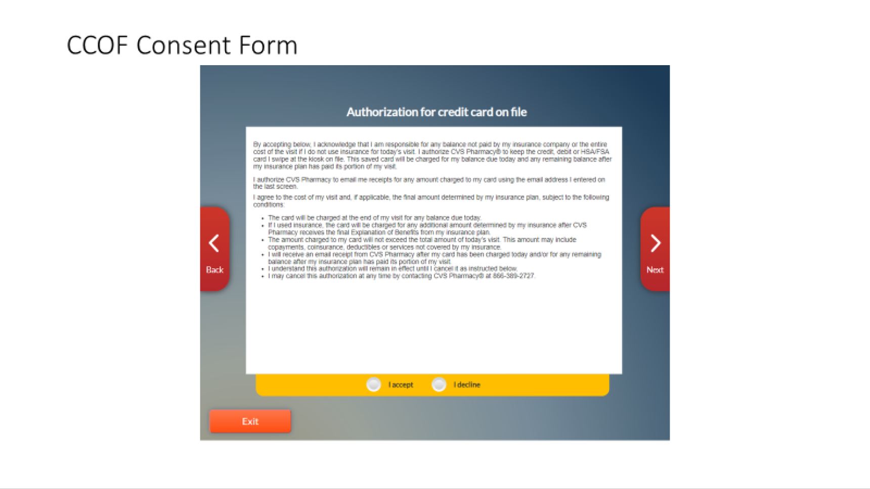
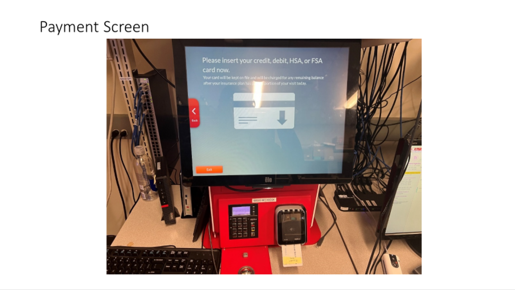
MinuteClinic had a kiosk check-in system, and it was fundamentally broken. Patients approached a dark interface with small text and confusing layouts, then met a flow that demanded everything before they'd secured a spot in the queue: name, date of birth, contact details, reason for visit, eligibility screeners, payment information, card-on-file consent, and walls of dense legal text, all before any certainty about when they'd be seen. Clinic staff were constantly stepping in to rescue check-ins or complete them manually.
The deeper problem wasn't the visual design, though that was genuinely poor. The structural problem was the information burden: the legacy flow treated check-in as a complete medical and financial intake, forcing every patient through the same 10+ mandatory steps regardless of why they came in. Meanwhile, staffing stayed reactive: one clinic turning patients away while another nearby sat with open availability, and no data to inform either.
The insight
Clinic staff feedback, complaints, and prior research pointed somewhere counterintuitive: the frustration wasn't fundamentally about wait time. Patients could tolerate waiting.
So the redesign had to answer a simple question: what information actually belongs in the check-in flow, and when? Remove everything else.
Key decisions
Strip the flow to only what belongs before the queue position
Chief complaint details, insurance, allergies, payment, card-on-file: none of it was needed to match a patient and put them in line, so none of it stayed in check-in. This wasn't about convenience; it was about information honesty. If a question doesn't need answering to secure a spot, it belongs later: after certainty, not before it.
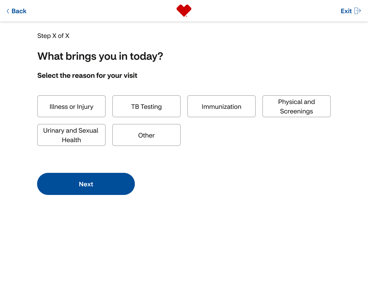
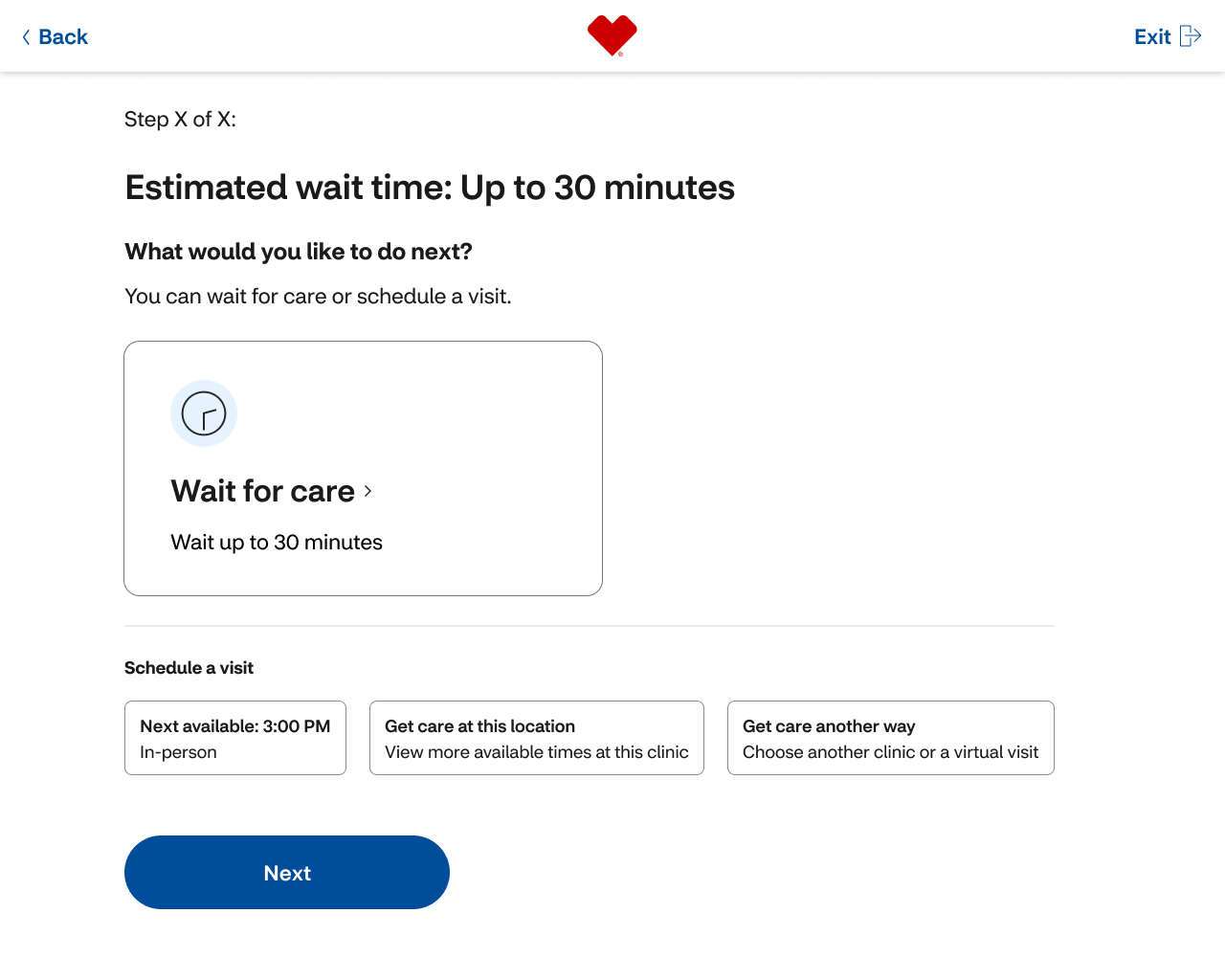
The tradeoffClinical staff collect more during intake instead. That's appropriate friction: by then, the patient is confident in their position. The result: 10+ steps became five. Match, reason for visit, queue position & estimated wait, consents, confirm.
Design large-format touch from first principles
A kiosk is a fundamentally different surface: viewing distance of one to two feet, a screen you physically reach to tap, users standing or seated, including patients in wheelchairs. No internal pattern library existed for it, so I used W3C large-format guidance as the baseline and adapted the Pulse design system: minimum 75px touch targets, 24px between elements, typography calibrated for viewing at a distance, and layouts that work from a wheelchair as well as standing height.
Build wait-time honesty into the core, and design for hardware that didn't exist yet
The moment a patient selected their reason for visit, they saw their queue position and estimated wait. No surprises later. This wasn't polish; it was structural to the whole redesign.
The system also had to run on legacy Linux hardware for immediate national rollout, but the accessibility team's Storm AudioNav keypad (tactile keys + audio guidance) was coming in Phase 2 on different hardware. I designed the architecture for the keypad before it existed, so Phase 1 launched accessible by design and Phase 2 needed no rework: the hardware just enabled what the software already expected.
The solution
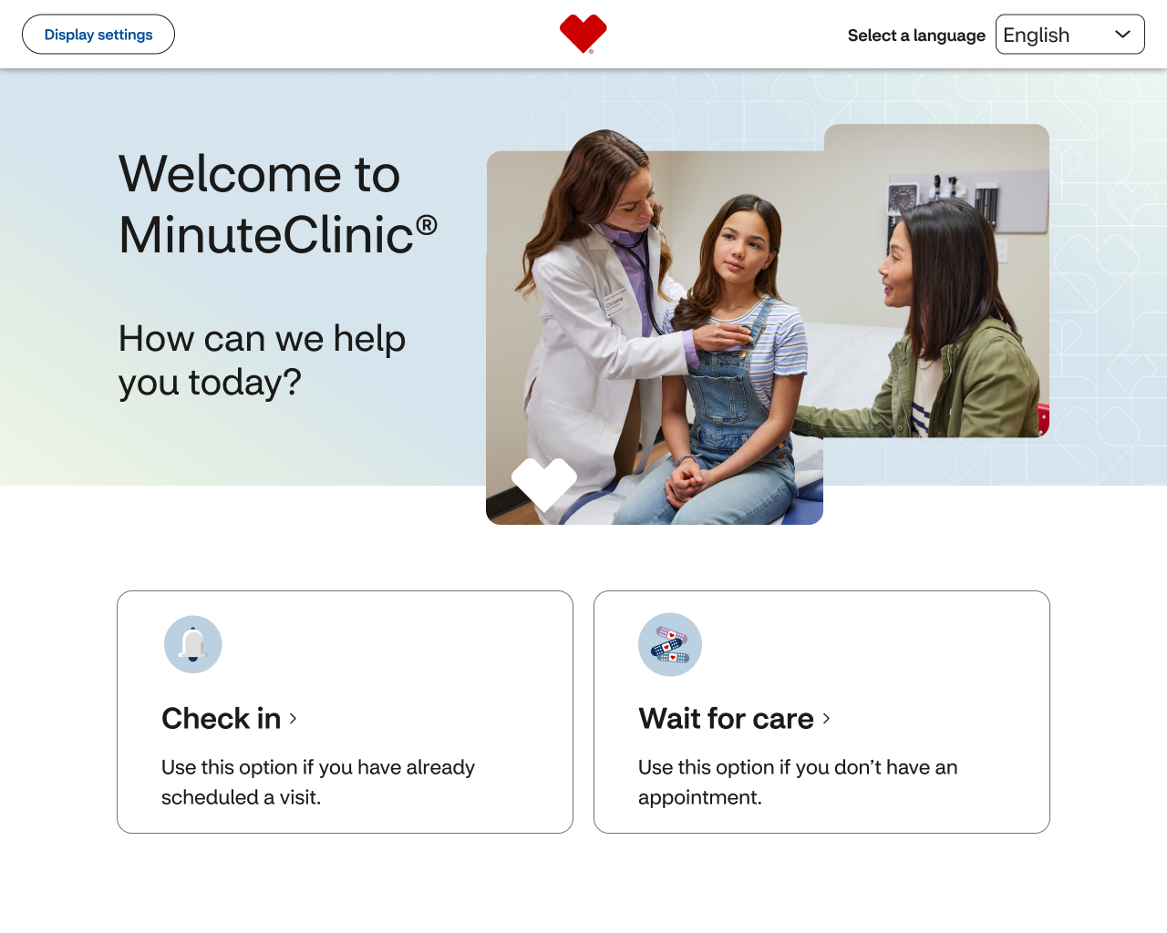
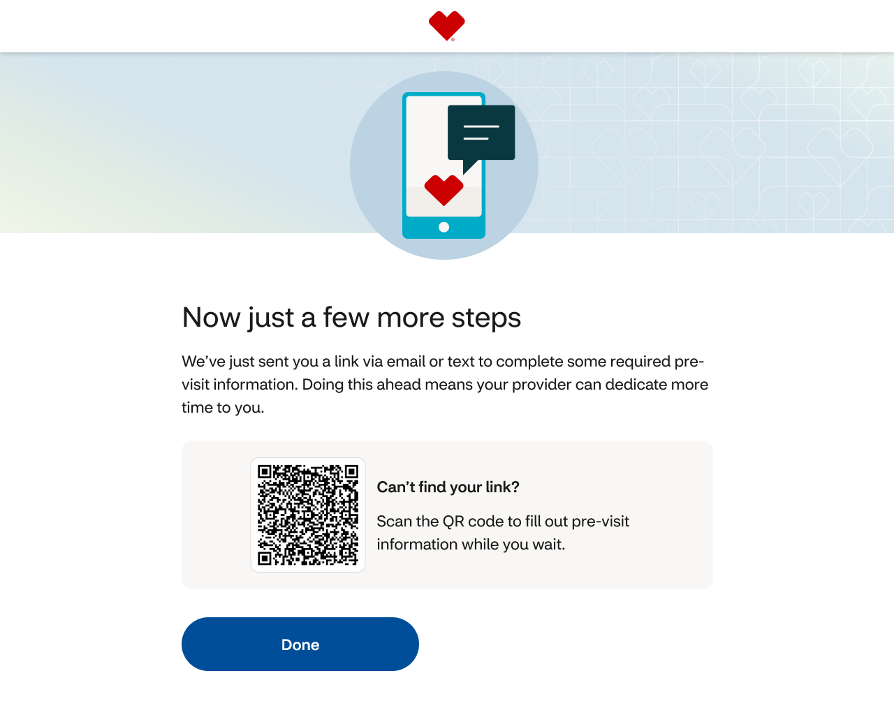
The redesign became a new front door to care. Patients approach a cleaner, more inviting interface and start with the choice that matters: check in for an appointment, or wait for care as a walk-in. The system asks only what's necessary (match yourself, pick your reason) and then comes the moment that changes the experience: a real spot in line, with a real estimate. Consents, a review, confirmation. Five steps instead of ten, each one moving the patient closer to certainty.
Patients using assistive technology get the same flow: audio guidance and tactile keys, no separate experience, no afterthought. The design became a kiosk standard that CVS Health now uses across teams, extending the broader Pulse Design System.
The outcomes
The estimates were a calibration decision, not a guess: we deliberately quoted conservative windows, betting that under-promising would beat raw accuracy. The measurement proved it: 84% of patients were seen within their window, actual waits averaged half the quoted time, and the routine positive surprise built trust. And for the first time, clinic managers could see real demand data: when their location peaks, which days surge, how staffing aligns. Staffing decisions shifted from reactive to informed. The kiosk became not just a patient interface but a tool that made the whole operation smarter.
What I took from this
The most important design decision is often about subtraction, not addition. Comprehensiveness at the wrong time creates friction that undermines trust, so I learned to interrogate every piece of information in a flow and ask: does this belong here, or later?
And "accessibility from day one" means exactly that. When Phase 1 launched without the AudioNav hardware, accessibility was already built in. When Phase 2 arrived, the keypad was just the hardware that enabled what the software expected. That sequencing changed how I approach every project since.