The problem
CVS Health generates enormous amounts of clinical data every day: labs, vitals, vaccination records, after-visit summaries. Across the business, that information was locked in fragmented legacy systems designed for bureaucracy rather than patients. On the web, patients could reach their records through dense portals built for desktop. But 64% of traffic to those systems came from mobile. People were trying to read lab results on four-inch screens.
The real constraint wasn't technical: the web experience was already responsive. What made this genuinely difficult was a design problem: patients weren't struggling to find information. They were struggling to understand it.
The insight
Most of what patients struggled with came down to one thing: context. "Your potassium is 3.8" means almost nothing to most people. An after-visit summary without structure is a wall of text that exhausts you before you learn anything.
We spoke with patients about their actual workflows. They didn't need faster navigation between screens. They needed information organized by what they had to understand first, with clear pathways to deeper detail when they wanted it.
Key decisions
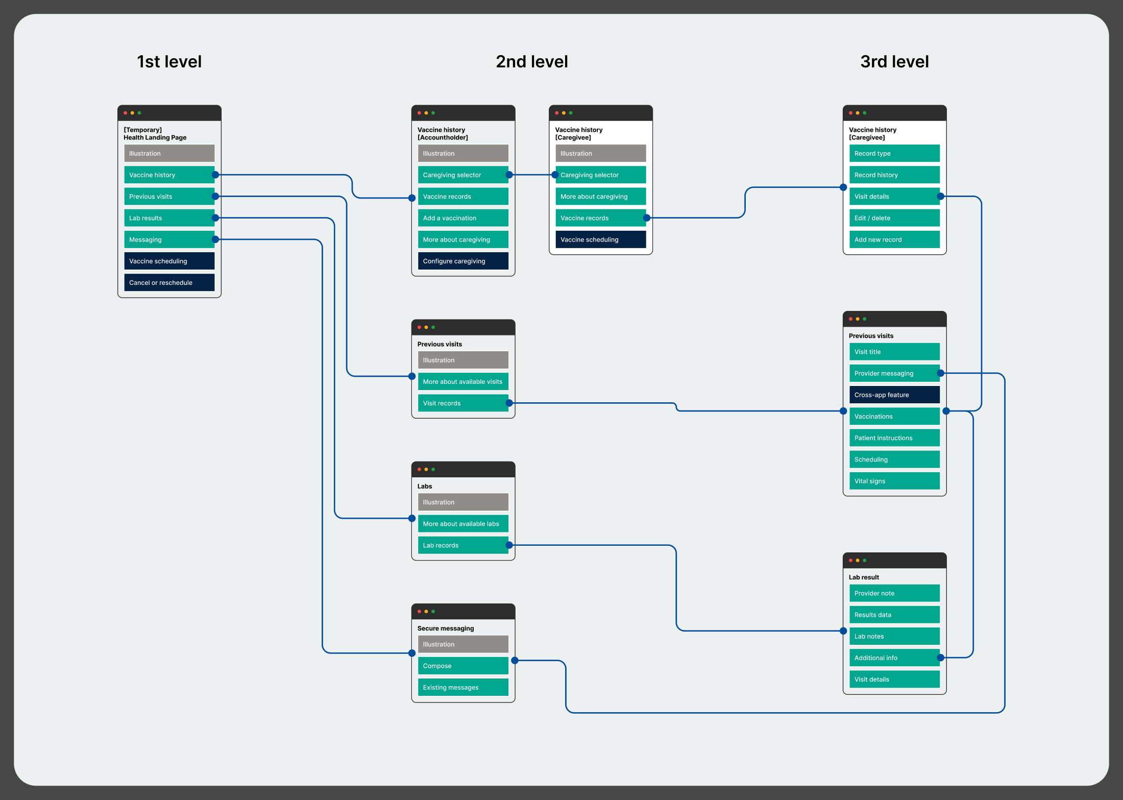
Native from the ground up, not a port
Porting the responsive web experience to the app sounded efficient, but it would have carried none of the affordances native brings. Native let us rethink information hierarchy for how people actually hold their phones, and gave us the platform accessibility tools that are foundational to trust in healthcare.
The tradeoffTwo parallel code paths, iOS and Android, maintained forever. For healthcare data on personal devices, that investment was non-negotiable.
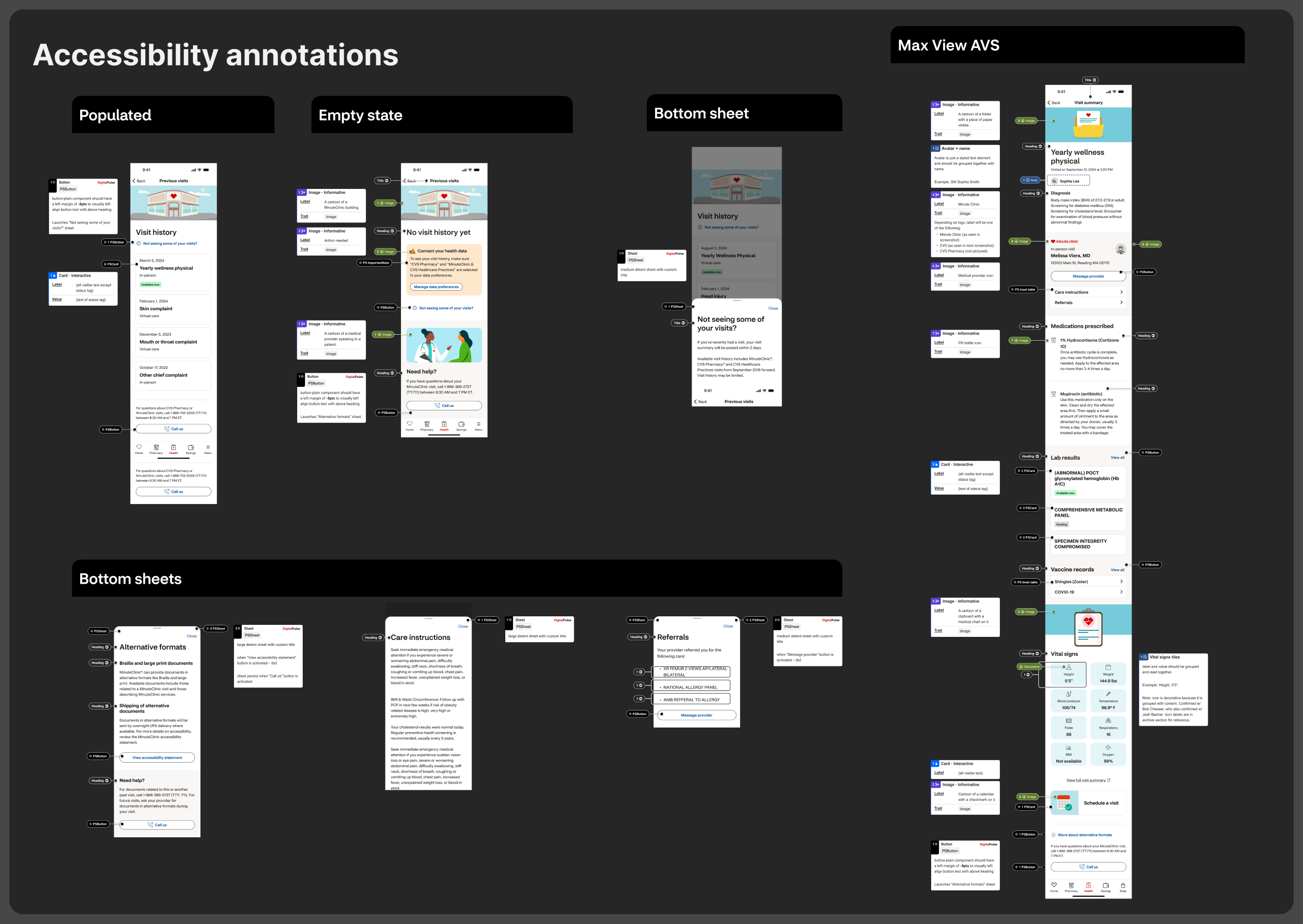
Accessibility as a starting condition, not a layer
Patients with low vision, patients on assistive technology, older adults unfamiliar with phones: all of them need to read their health information. So accessibility wasn't a design consideration or a compliance requirement. How we organized the page, sized text, structured touch targets, and wrote semantic labels, these weren't separate from the design. They were the design.
Information hierarchy for mixed health literacy
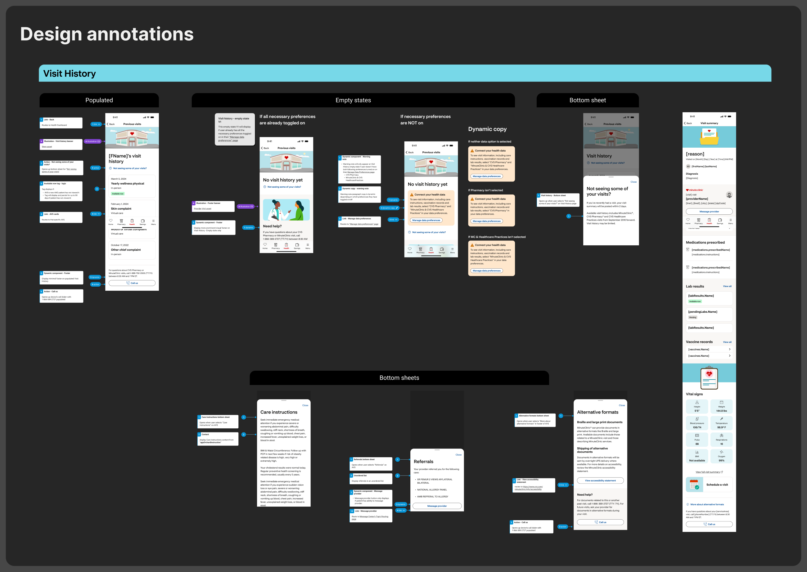
Some patients know what "hyperkalemia" means; most don't. We led with what the provider recommended, then why, and then, for those who wanted it, the clinical context. And we deliberately avoided accordions: they feel efficient to designers, but they hide information. Detailed items opened in their own native sheets instead: you tap, it opens in a focused space, and there's never a question of whether you've seen everything.
The solution
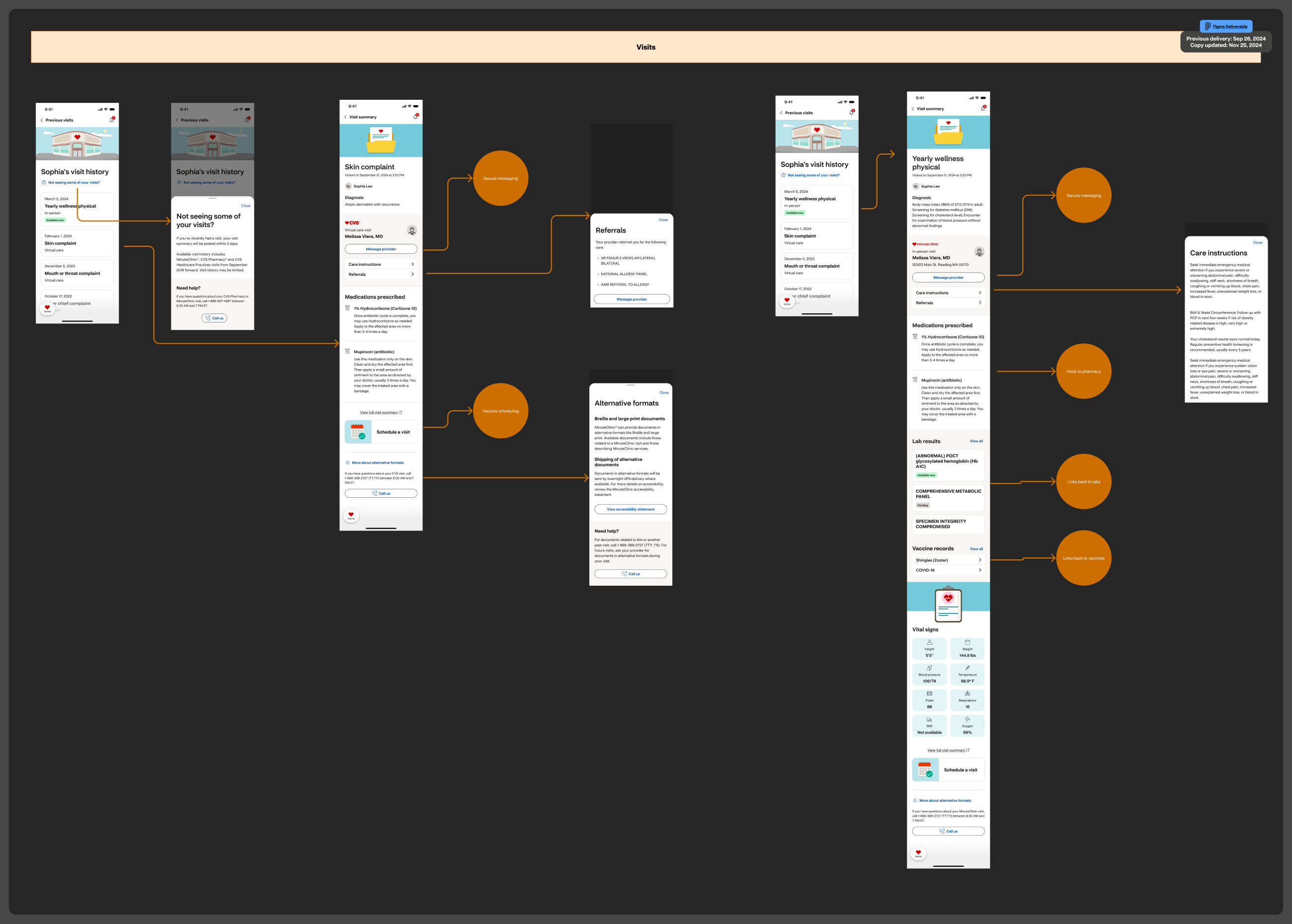
The After Visit Summary became a long scrolling page of discrete section blocks: what the provider noted, medications, labs drawn, vaccines given, vitals, follow-up. The most actionable information led: prescriptions early, care instructions prominent. Patients could scan for what mattered, then scroll for context.
Every pattern served comprehension over navigation. Provider names appeared with a photo. Medications appeared with their purpose, not just the generic label. Lab results appeared with a simple reference range so patients could see whether a number was in the expected zone without reading fine print. We made every number mean something by giving it a frame of reference. Every section answered the question a patient would actually ask: "Why did the doctor tell me this, and what do I do about it?"
The outcomes
That's millions of patients every month reaching their information through an experience built for how they actually use their phones. And the increases aren't navigation improvements: they're engagement increases. Lab result views climbed 56% and vaccine history 33%. Patients went from avoiding their health records on mobile to actively checking them.
What I took from this
The most elegant technical solution means nothing if it doesn't account for human understanding. Information architecture and comprehension aren't separate from design, they are design.
I also learned how much clarity comes from constraints. A native mobile screen has no infinite space; you can't hide things in menus. You have to choose what matters most, and that constraint pushed us toward more honest, more direct designs.